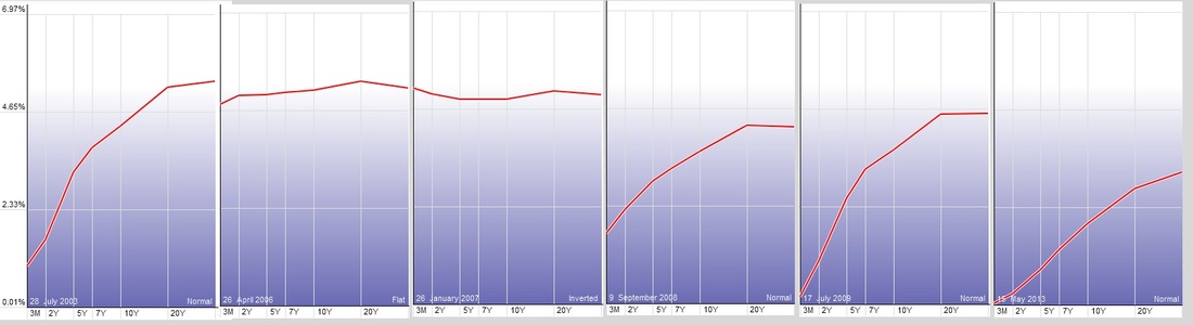
The yield curve plots the interest rates of bonds with different maturity dates at a specific time. Usually the yield curve compares the three-month, two-year, five-year, seven-year, 10-year, 20-year and 30-year Treasury debt. Studying the yield curve helps us to better understand the economic cycle and predict changes in the economic growth. At different stages of the economic cycle the yield curve also changes shape. There are three main types of yield curves, normal, flat and inverted. The yield curve is normal when the interest rate of bonds with shorter maturity date is less then with longer maturity dates. Normal yield curve is associated with strong and healthy economy. After an extended period of time the spread between interest rates of bonds with shorter term maturity date and longer term maturity date decreases. At some point the yield curve flattens out and even gets inverted where the interest rate of bonds with longer maturity date is less than for bonds with shorter maturity date. This scenario happens months or years before the economic cycle reaches a peak and turns into recession. The chart below shows the yield curve at different times (see red vertical lines on the chart below). On this chart you can see how the yield curve changed shape. Currently the yield curve is normal which is very healthy for the stock market. It is not as steep as it was in 2009 (see the chart below).


 RSS Feed
